TinyMCE 4’s default theme gives a lot less toolbar buttons per mile than TinyMCE 3 did. Here we look at using menu buttons to improve its fuel efficiency.
If you’re upgrading a TinyMCE 3 application to use version 4 one thing you won’t fail to notice is just how much bigger the toolbar buttons are in the default theme:-


Whatever your views on the aesthetics of this change if your TinyMCE 3 app had one or two fully packed toolbars, you’re going to have to make some changes when upgrading if you want to avoid a rather shoddy wrapped toolbar look-and-feel:-


If you’re not already using all three toolbars one option might be to add a second or third to your page, though this does rob some screen space and can look a little too busy. Moving functionality to the menu bar or context menu is another approach, though again it can detract from your otherwise simple look-and-feel and means functions aren’t all available in the same place. A further option would be to just increase the width of the TinyMCE editor so you have more toolbar inches to play with, though this can create some challenges when grappling with richer, fixed-width page layouts.
An alternative you might want to consider is creating a custom drop-down toolbar button to “roll-up” similar or less frequently used options. This keeps everything accessible from the toolbar while trimming a few inches off the space it needs.
Creating a menu button plugin
The overflowing TinyMCE 4 toolbar above has a group of link related options – link, unlink, anchor and horizontal rule – which looks like a good candidate for rolling up into a single button and getting us back to a single row.
We’ll start by creating a plugin which adds a parent menu button to our toolbar and we’ll remove the four buttons we’re going to put under it. To do this we create a rollups folder in our plugins folder and create a plugin.js which looks like this:-
tinymce.PluginManager.add('rollups', function(editor, url) {
       editor.addButton('linksrollup',
              {type   : 'MenuButton',
               icon   : 'link',
               title  : 'Link Options',
               menu   : []
       });
});
Here we’re defining a single new toolbar button called linksrollup and we’re re-using the normal link icon for it and setting a tooltip of Link Options.
We now add this plugin to our editor’s plugins list and replace the four underlying toolbar buttons with our new linksrollup button:-
<script type="text/javascript">
    tinyMCE.init({
        …
        plugins   : 'anchor,link,hr,rollups',
        …
        toolbar1  : 'undo redo | bold italic underline | ' +
                    'alignleft aligncenter alignright | ' +
                    'bullist numlist | linksrollup'
    });
</script>
Our toolbar is now back to a single row with our new Link Options drop-down sitting at the end of it:-

Next we need to insert the four buttons we’re replacing into its drop-down menu.
Rolling up toolbar buttons
We could create our menu items from scratch but this duplicates a lot of information available elsewhere in the core editor. Many editor commands are already defined as menu items and available in the editor.menuItems array and reusing these where possible will give us the icon, text and associated command details without having to repeat them in our plugin. To kick off we’ll simply copy the toolbar button names into our menu and see where that gets us:-
tinymce.PluginManager.add('rollups', function(editor, url) {
       editor.addButton('linksrollup',
                      {type   : 'MenuButton',
                       icon   : 'link',
                       title  : 'Link Options',
                       menu   : [editor.menuItems['link'],
                                 editor.menuItems['unlink'],
                                 editor.menuItems['anchor'],
                                 editor.menuItems['hr']]
       });
});
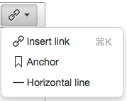
This gives us a 75% success rate. Almost … but not quite there!

A little digging into the link plugin reveals that it does not create a menu item for the Unlink command. The configuration for the toolbar button it defines looks like this:-
editor.addButton('unlink', {
        icon: 'unlink',
        tooltip: 'Remove link',
        cmd: 'unlink',
        stateSelector: 'a[href]'
});
We can create a MenuItem with these settings on-the-fly when we create our menu, or we can simply add it to the editor’s menu item list and then reference it when creating our menu as here:-
tinymce.PluginManager.add('rollups', function(editor, url) {
       editor.addMenuItem('unlink', {text: 'Remove link',
                                     icon: 'unlink',
                                     cmd: 'Unlink'});
       editor.addButton('linksrollup',
                      {type   : 'MenuButton',
                       icon   : 'link',
                       title  : 'Link Options',
                       menu   : [editor.menuItems['link'],
                                 editor.menuItems['unlink'],
                                 editor.menuItems['anchor'],
                                 editor.menuItems['hr']]
       });
});
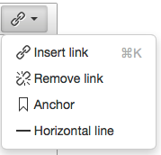
This finally gives us a toolbar drop-down menu that replaces our four original buttons:-


This is cool for what it does… but do you know of a way to make the new toolbar look like the old? Seems like someone would have done this but I can’t find anything.
Not that I’m aware of – I only have one client using TinyMCE 4 and they wanted the new look and feel.
If it’s just the smaller buttons you’re after you can probably achieve it with a few CSS tweaks (since the button content is font based and scalable) – changing
font-size,line-height,widthandheighton.mce-icoalong withpaddingandline-heighton.mce-btn buttondefinitely packs more in per inch. Probably a few more tweaks needed to make it complete and cross-browser though.